Yoko Yoko Fried Dumplings
Brand Identityブランドデザイン
TYPE
仕事の提案
Proposal Pitch
SOFTWARE / MATERIAL
• Illustrator
DESIGN
Shannon Teoh
2015
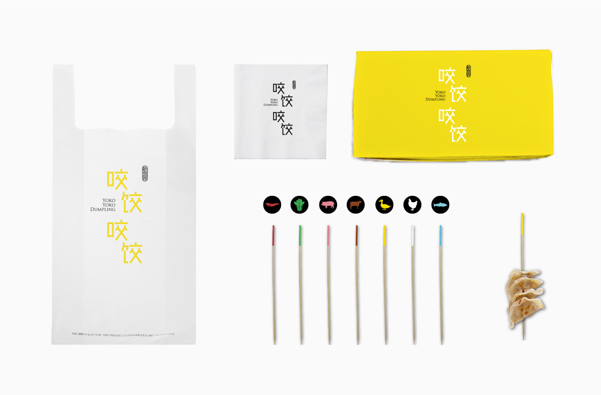
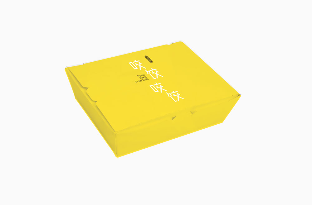
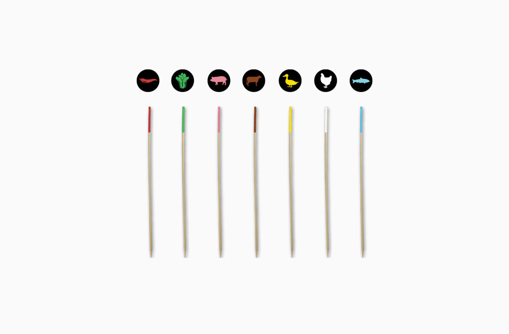
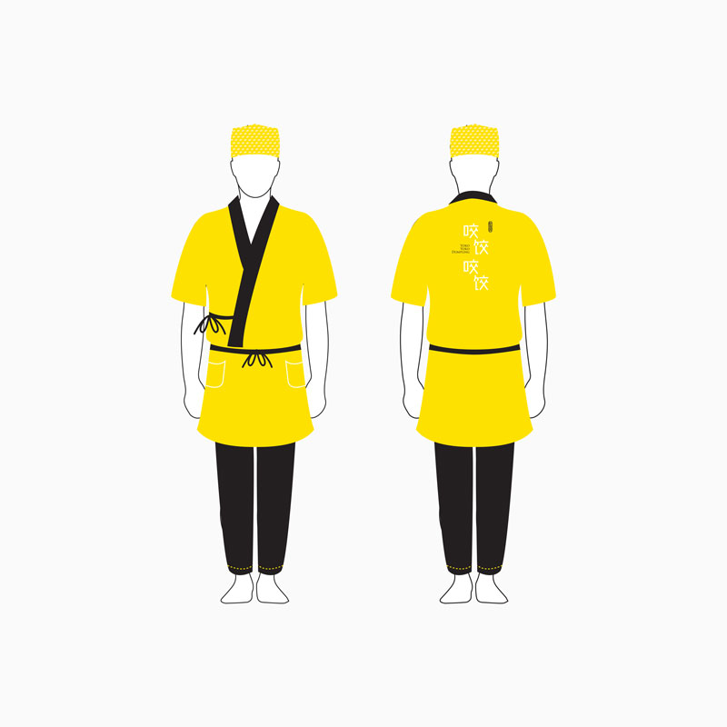
Yoko Yoko is a fried dumpling brand presented to be both catchy and casual. Bright Yellow keeps the upbeat feel of the brand while crisp and stick-like typography keeps the brand clear and simple.
キャッチーとカジュアルな感じで作った餃子ブランド。頭に残りやすく浮かびやすくするため、パワフルな色味と棒型タイポグラフィで独特なブランドイメージを作った。

Logo versions
ロゴの種類
Collaterals
ショップ用品
Takeout box
テイクアウトボックス
A universal menu system is made by dipping the tip of each dumpling stick with a colour-coat that determines its flavour.
棒の一端で色をつけて、言語を超えられるカラフルなメニューシステムができる。
Uniform
制服