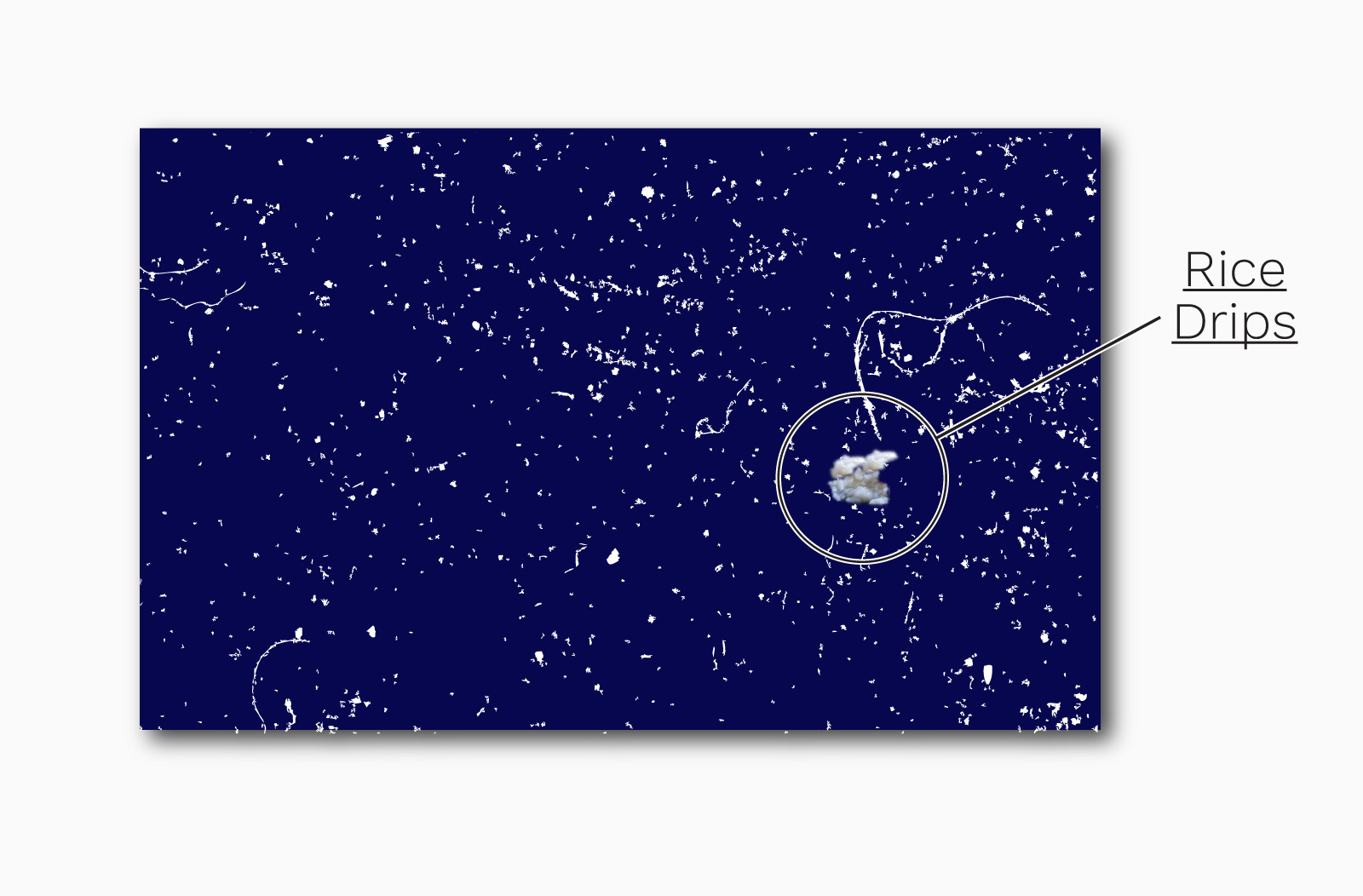
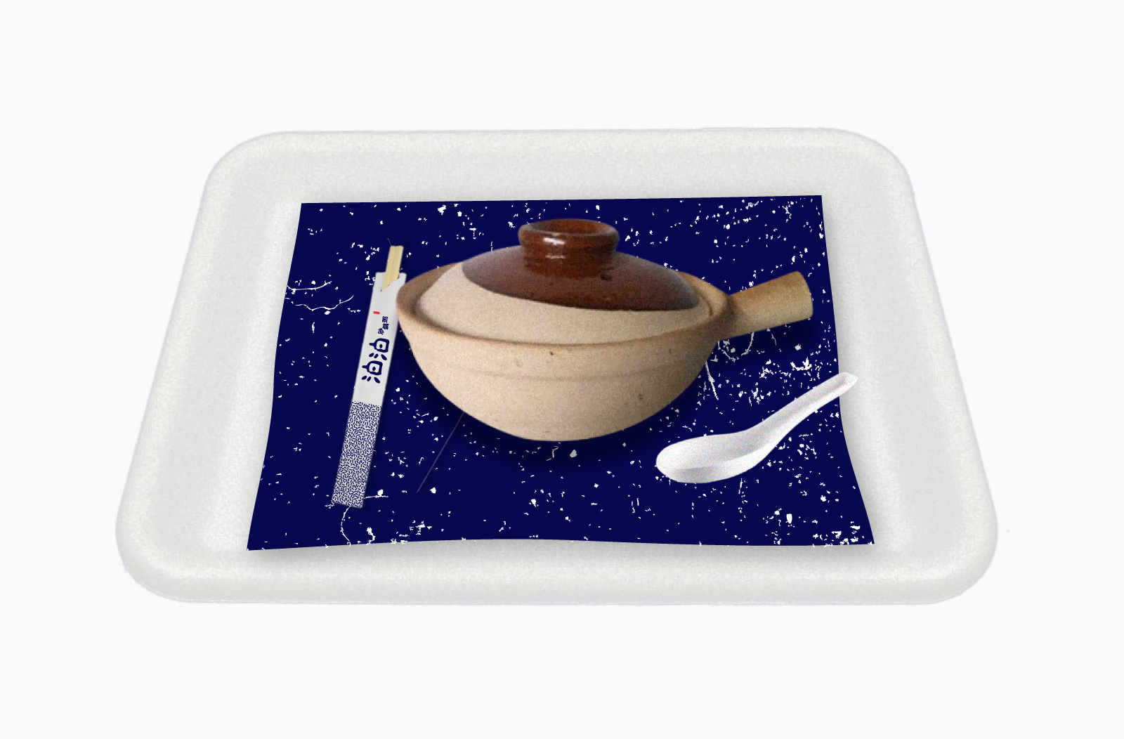
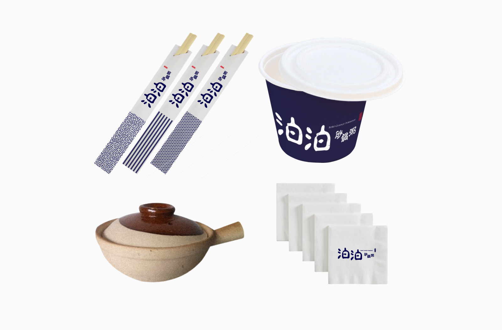
People tend to accidentally drip their porridge when eating, making a mess on the table. Using our claypot texture, we make a trayliner that will not only make the mess less obvious but also make it to be part of a beautiful mess. お客様は食べる時に、お粥をこぼしがちなので、お粥が何滴か乗
っても目立たないように土鍋の質感で印刷されたトレイマットを
デザインした。

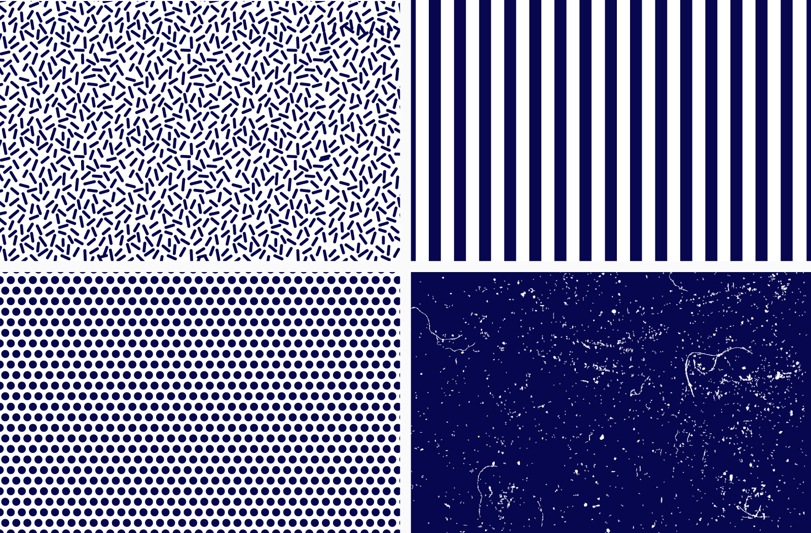
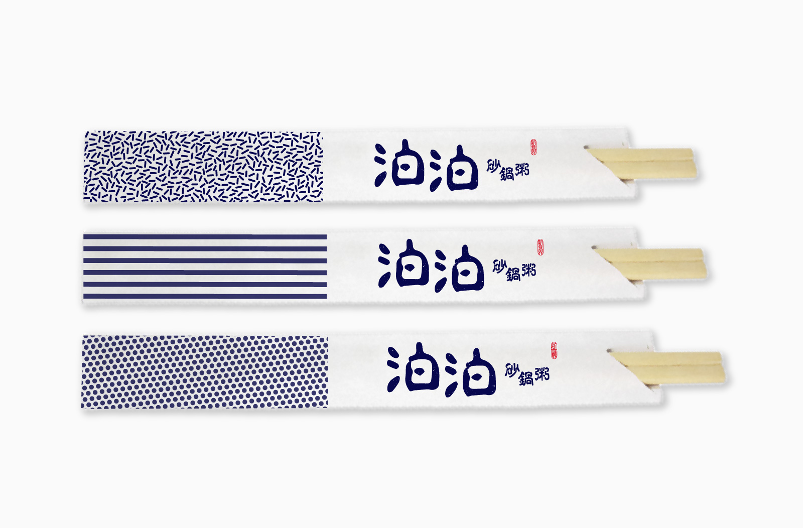
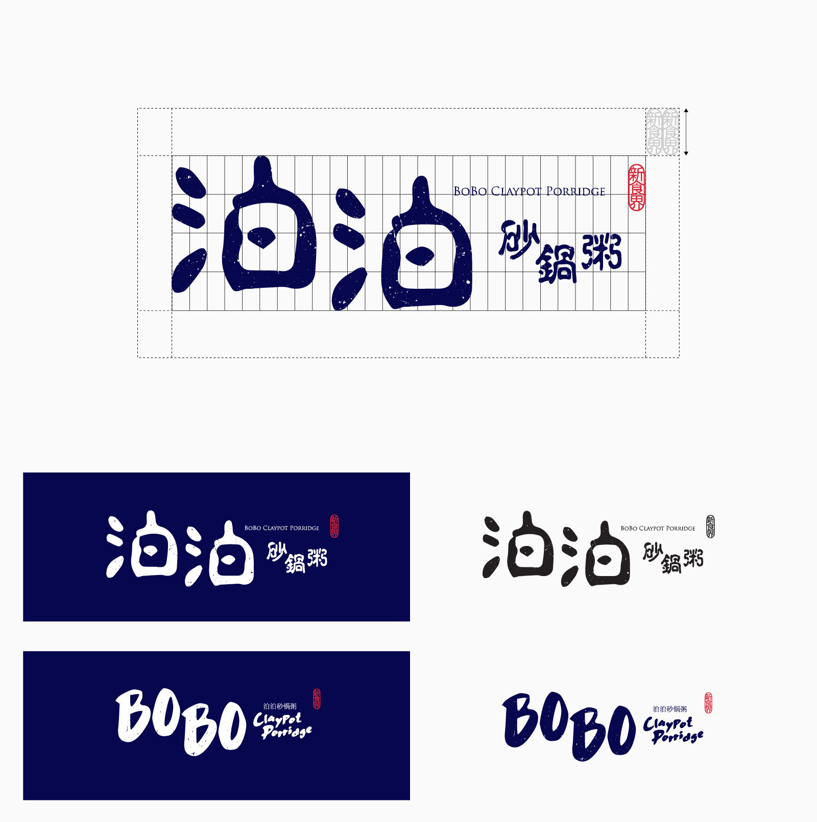 Logo versions