
 JUNE 2, 2021
Today I want to explore various Japanese corporations and the trends they are adopting through the designs of Kashiwa Sato– Uniqlo, Mitsui Corporation, Seven & i: The conditions vary greatly when designing for each of these businesses.
Before I talk about these examples, I would like to introduce Kashiwa Sato himself. After graduating from Tama Art University, he worked for advertising agency Hakuhodo. After several breakthrough campaigns, he established his own design office in 2000 by the same of Samurai. Today his work ranges from advertising to brand strategies and more.
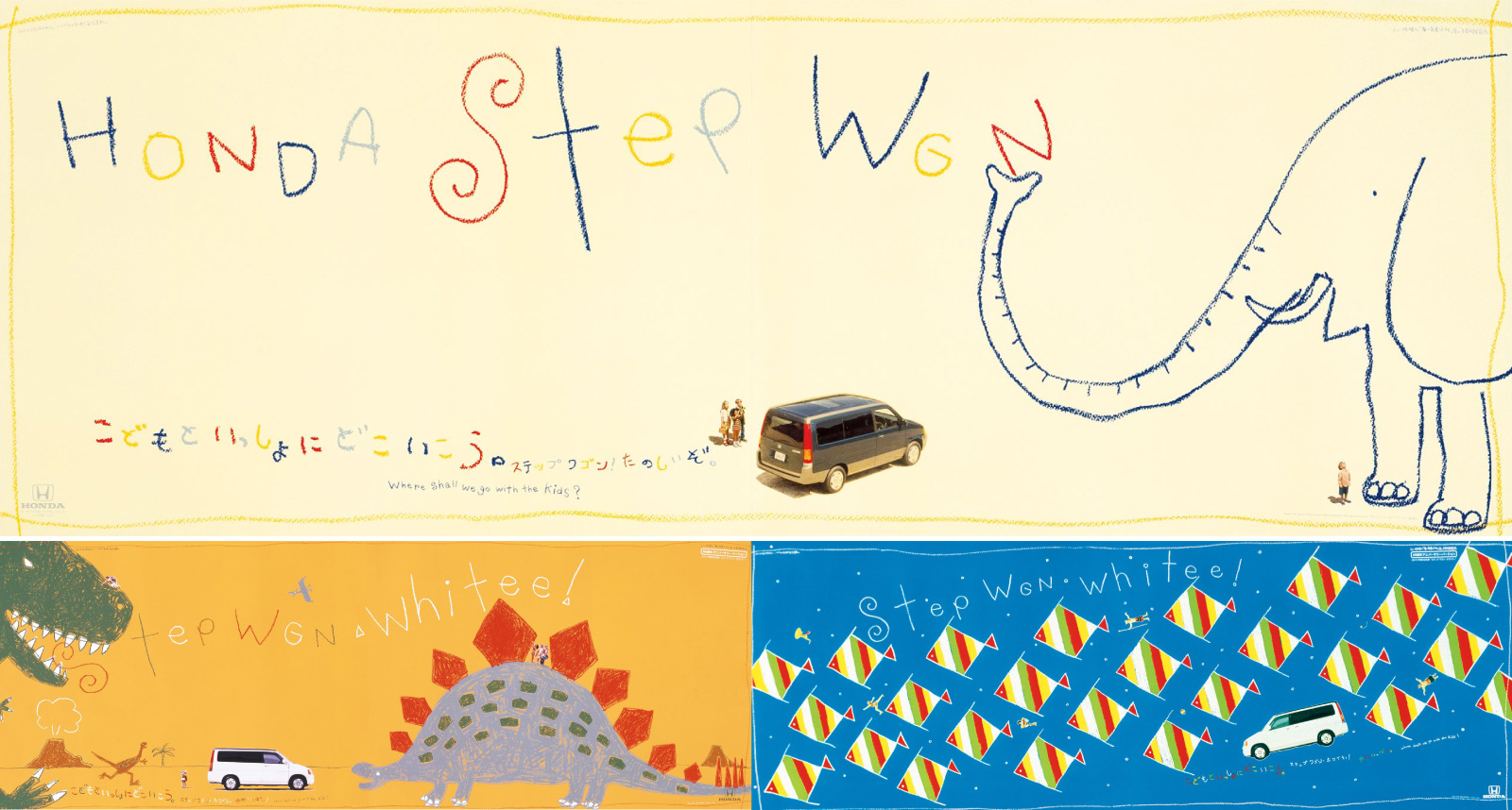
The first work I want to talk about is his breakthrough work, the 1997 Honda Step Wagon ad campaign. The Step Wagon is especially difficult to advertise with its lack of special features as compared to rival vehicles. It was also an era where specifications and situational photos of the vehicle in use was the norm. However the Step Wagon is difficult to differentiate specification-wise; under this challenging circumstances Sato created an idea that overturned the then conventional vehicle advertising.
Along with the copy,
[Where should I go with my kids?],
and crayon imagery of the irreplaceable experience of going out as a family, an atmosphere of that of a children’s storybook is created. Rather than Honda’s brand or product photos, he used the happiness of anyone with a family to create a truly impressionable advertisement.
The Honda Step Wagon went on to become and hot topic and a hit product with 100,000 sales annually.
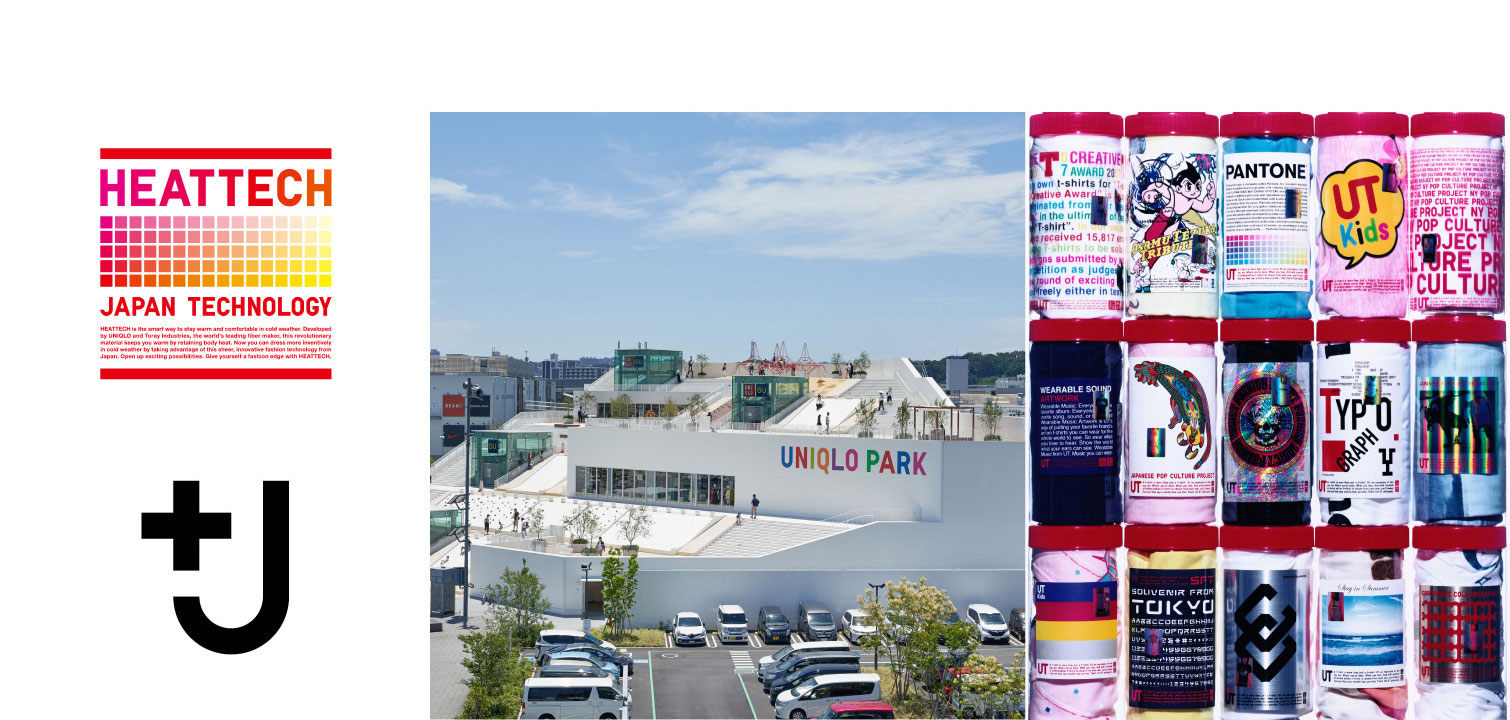
Wildly successful as a global brand, Uniqlo once failed in over- seas expansion. From 2001 they had to close down 16 of their 21 outlets in England and their profit in America and China had been unstable. In 2006 when Uniqlo’s founder Yanai contacted Sato Kashiwa right after seeing a documentary about him.
Starting from their New York Soho Flagship store to creative directing their global brand strategy, Sato designed their new brand identity as well as advertising campaigns among others.
Sato noticed that apparel brands like H&M and Zara put in the frontlines the fact that they are from their home countries of Sweden and Spain; and he thought: “We can only win if we push out the strengths of Japan” In the end he came up with a logo that absorbs the pop culture of Japan in areas like anime or manga. The result is the widely recognized logo identity we know of about Uniqlo today.
Since then Sato worked with Uniqlo to push out iconic series and hit campaigns like “UT” “+J” “BigQlo” among others. I think it is no exaggeration to say that the 15 year relationship with Sato and Uniqlo is the ideal client-designer relationship.
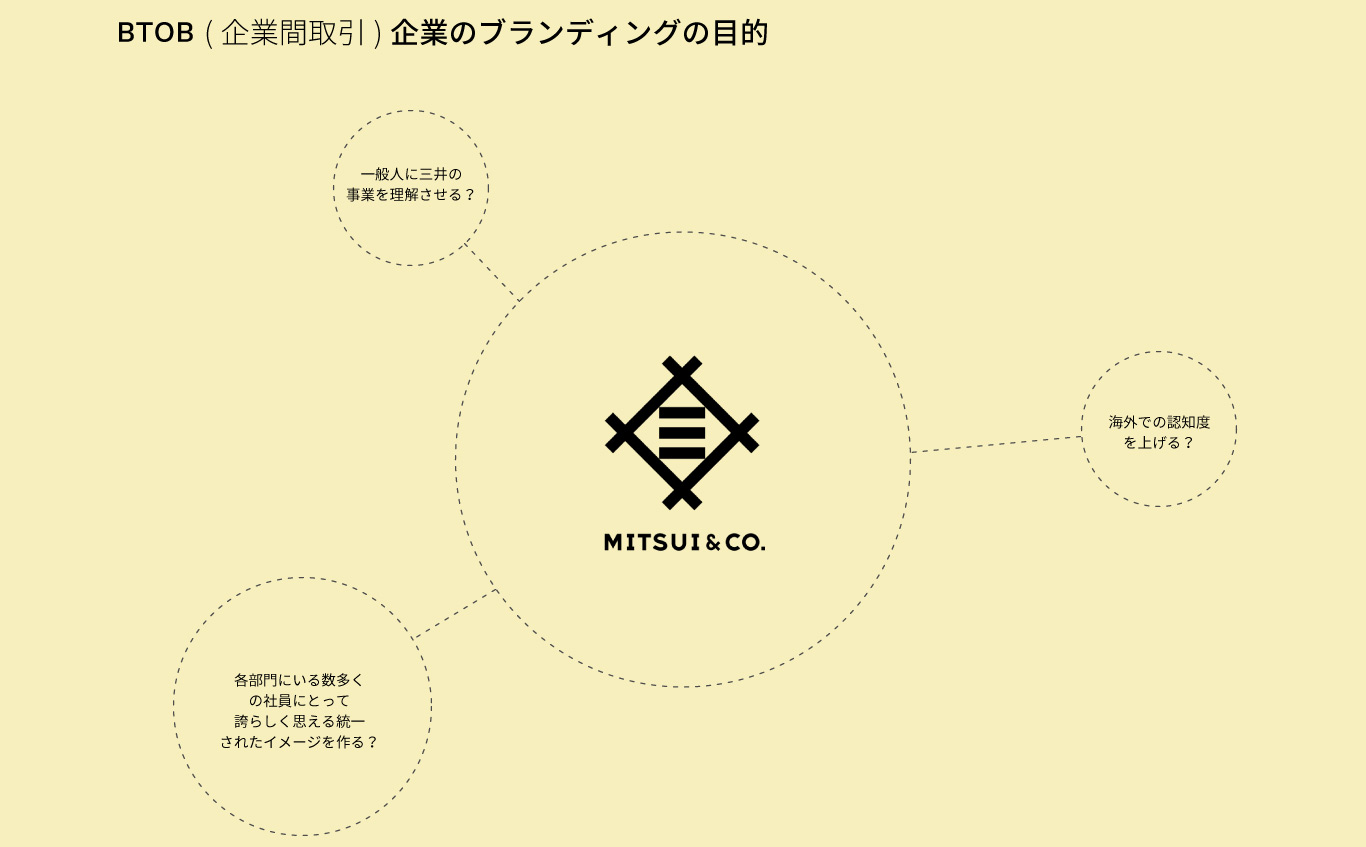
Sato was assigned the branding project for Mitsui & Co. in 2014. At that time, a case of a BtoB enterprise undergoing a major rebranding is extremely rare, in other words, a strange case. Looking at Japan’s business landscape where many BtoB enterprises are undergoing proper branding, you can say that the branding of Mitsui & Co. marked the rise of BtoB branding in Japan.
From the brand concept and logo to an advertising campaign conceptualized with actual employees; Sato took charge in a variety of direction. For the advertising campaign, he had 15 project members that each department recommended who joins in on the discussion while carrying on with their daily work.They share their departments unique strengths, the value they provide and the direction they should head towards.
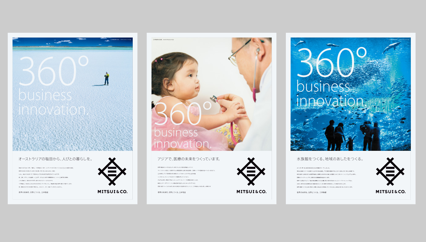
This overall branding signifies the value of branding a BTOB company as complicated as a general trading companies. Perhaps it is to appeal to new graduates and their families to show the kind of work they provide. Perhaps it is to unify the thousands of employees in the vastly different departments. This project can be said to be an exemplary role model; soon after the rebranding, Warren Buffet's Berkshire Hathaway invested huge amounts into MItsui & Co., signifying an interesting future to come.
Before talking about the Seven Eleven Project that Sato took on, I want to clarify a question that I have long held. When I first came to Japan, I wondered ‘Why was it called "Seven & i" instead of just Seven Eleven?’ After some digging I found out that it was to defend against a hostile acquisition.
Seven Eleven was originally an American Enterprise but it was acquired by Japanese department store Itoyokado in 1991. Despite being the subsidiary, it outgrew its parent company and complicated the relationship. At a point, Itoyokado’s market caps was only around half of subsidiary Seven Eleven’s who was listed on the stock exchange by then.
When a subsidiary grows bigger than the parent company, the parent would easily become a target of a hostile buyout. This is because, by buying the parent company of Itoyokado that has lower stock prices, you could acquire Seven Eleven Japan together at an extremely cheap rate. To protect against this, a holding company was created to hold both Itoyokado and Seven Eleven Japan: you get to increase the market value and increase the number of issued stocks which helps defend against a forced buyout. Therefore, the shareholders of both Itoyokado and Seven Eleven transferred their stocks to form Seven & i holdings.
Sato was in charged of redesigning Seven Eleven’s private brand “Seven & i”. Without relying on its image as a national brand, he redesigned each item for an image of increased quality.
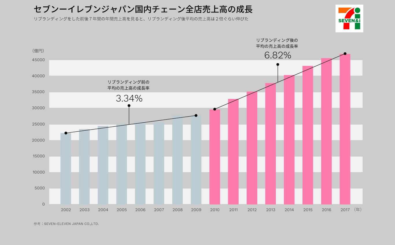
Despite the huge number of items, Sato created detailed rules for each item and their packaging. The includes the font size, spacing and even how the photograph should be taken. He is known to be particular about how each packaging should communicate for the most effective sales. His effort proved to be worthy as Seven Eleven’s average annual growth more than doubled in the 7 years after rebranding as compared to the 7 years before.
Sato once said: "When making rules, SAMURAI deals with irregular and hard-to-judge cases. For instance, for breads with the same outer appearance but different fillings, we include cross section photos; just like this we adapt our rules case by case. It doesn't mean its the end once you establish a rule, we continuously update it while maintaining the brand image. Its a tough but when you deal with this volume of products, you need both strictness and flexibility or risk being up all over the place."
Kashiwa Sato has both works that are so simple they make people question “Where’s the design?” and works with sophisticated details. Between the surreal contrast is the unwavering consideration towards actual results and effect. Even if it betrays his sense of aesthetics, even if it overturns conventional logic, Sato will go for the strategy that is most effective for his clients. I believe this honesty reflects design itself. There are lots to study about Kashiwa Sato–from his bold attitude to his brazen speech.