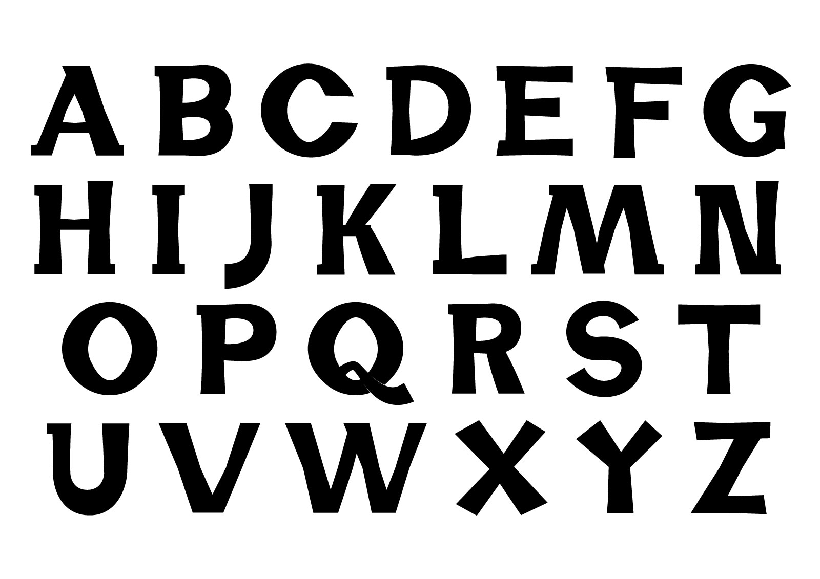
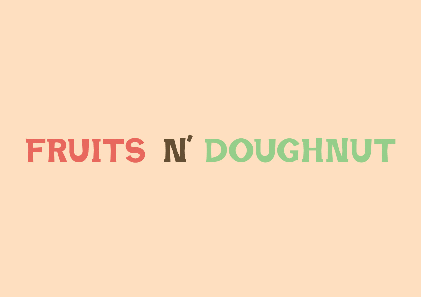
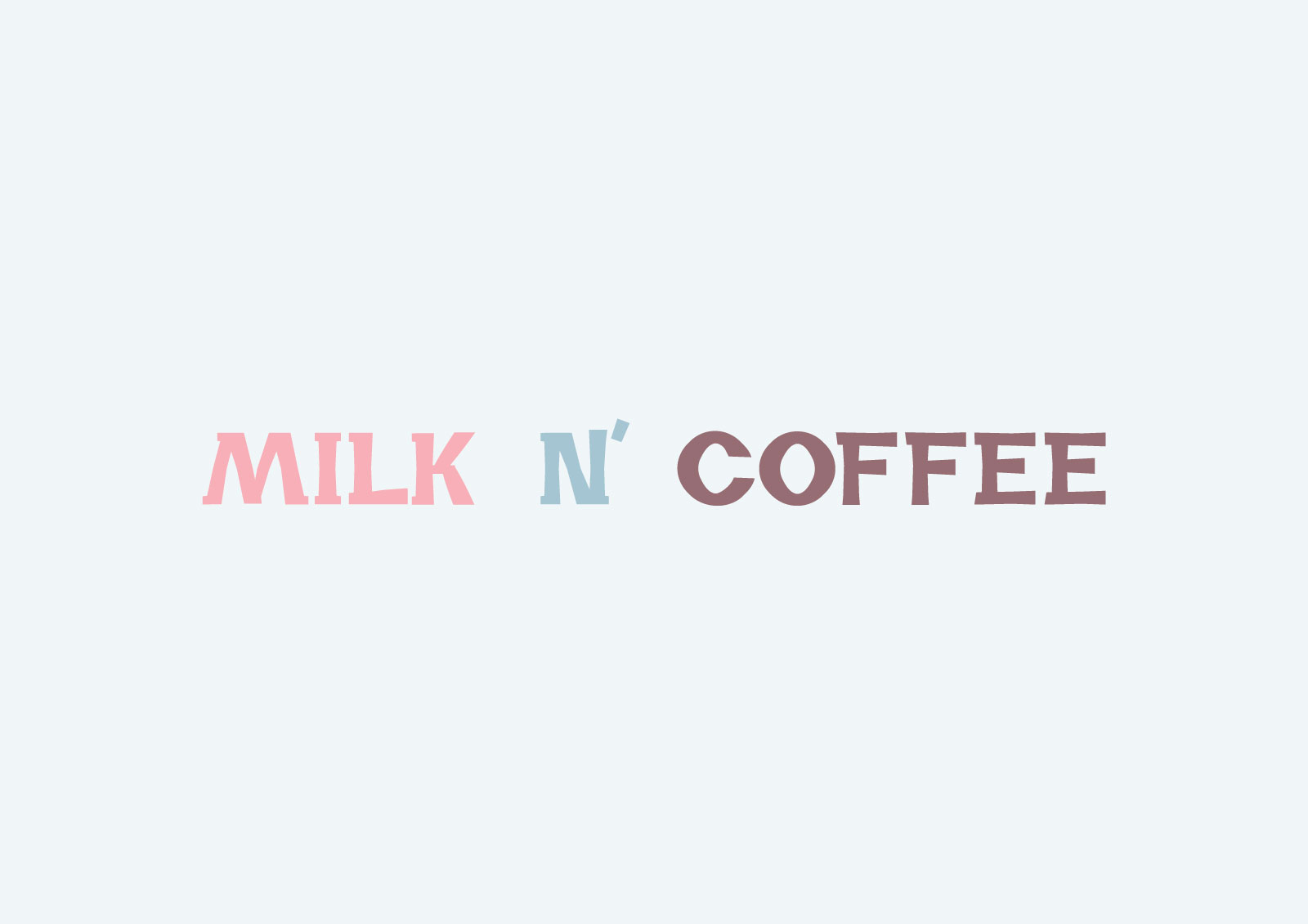
Sans serif and serif fonts are the mainstream these days but a look at 19-20th Century Type foundries reveals countless beautiful Display and Slab Serif fonts. I combined both styles to create this original typeface.
最近サンス・セリフとセリフの書体が圧倒的に主流だが、19〜20世紀の書体鋳造を見ると、ディスプレイやスラブセリフなども綺麗で無数ある。今回ディスプレイとスラブセリフの組み合わせで、独特な個性のあるオリジナル書体を手がけた。