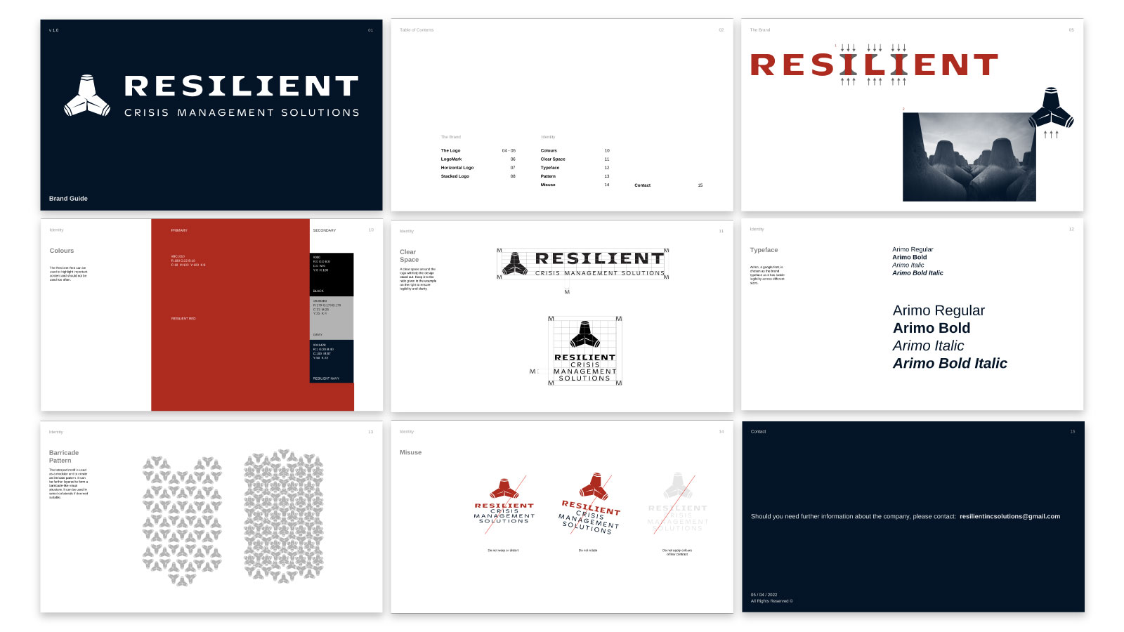
A sturdy and robust identity for RCMS, a company that develops defense-related systems and apps. 防衛防災に関するアプリやサービスを開発する会社のために盾のようにたくましいマークとロゴタイプを組んだ。
Logo versions ロゴの種類
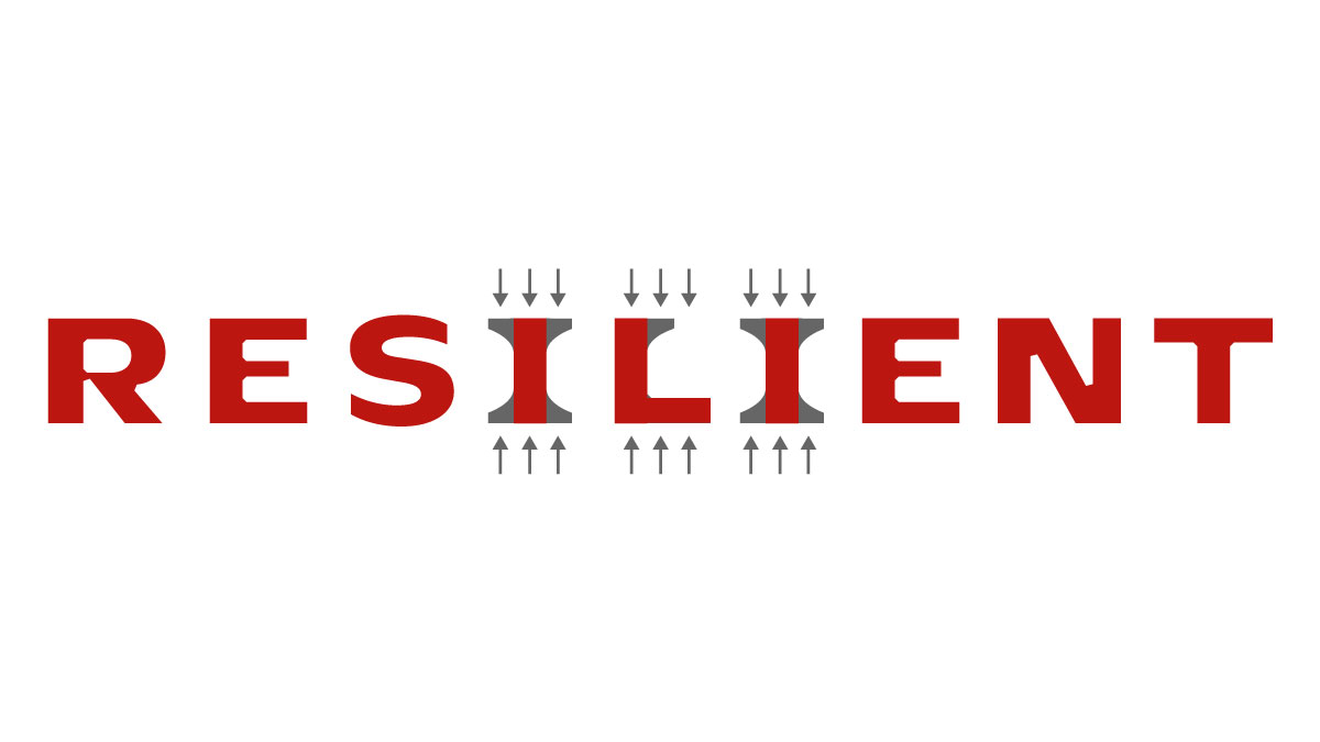
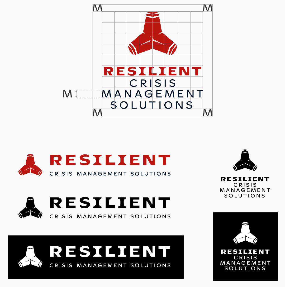
The logotype has a sans serif base and bracket serifs attached to select alphabets. It signifies stability and the company's tenacity in building strong systems. サンズセリフベースの書体にブラケットセリフを付けることによって安定感を表現した。
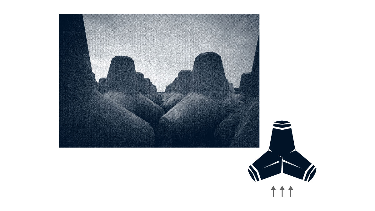
The logo uses a motif inspired by tetrapods, a type of concrete armour unit that lines along shores to combat strong tides. It represents the company's varied systems working together to defend against waves of crises. テトラポットという海岸などの護岸や水制を目的に設置するコンクリートブロックをモチーフにしてロゴマークをデザインした。会社が人々を危機の波から守ろうとする精神を表現するためだ。

 Logo versions